Text input
 |
Summary
|
Java
Related design guidelines |
The virtual keypad is revealed whenever the user taps on an element that requires text input. Inline editing should be applied wherever possible to show context while user is typing. Separate input states, such as data queries, are only recommended for short input situations, such as PIN code query. For inline editing, the keypad slides up from the bottom of the screen as an overlay to the screen content when phone is in portrait orientation. In landscape orientation the writing mode occupies the screen fully and thus no context is shown. Action 1 closes the keypad and returns to the initial layout. Keypad can also be closed by dragging it down.
If the input field is at the bottom of the screen, the content needs to slide up as well so that the input field is shown above the virtual keypad. The input text field is shown active and cursor is blinking when the keypad is ready for typing. The user can move the cursor by a single tap on the intended position. Horizontal drag/flick on the row in the text input moves the cursor to the left/right respectively. This is needed in case single tap is not accurate enough. The user can drag or flick the content vertically up or down. The keypad slides down if the user activates a type of field that does not require input. If the user selects successive text input fields, the keypad remains in its position. The keypad type changes as per physical orientation of the phone.
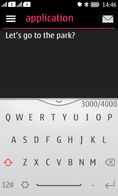
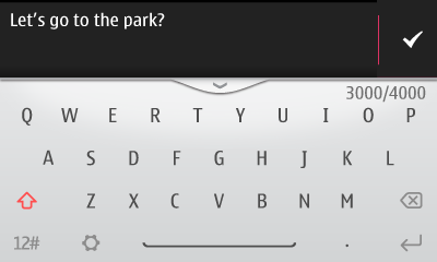
In portrait mode different keypad types are available: ITU-T, qwerty and (if available in device variant) language-specific input modes like Chinese handwriting. The type shown depends on the user setting selected for the writing language in use. In landscape orientation the keypad type is always qwerty. It occupies the screen fully and thus no context is shown in landscape mode.
The layout of the virtual keypad may be adapted to fit frequently used characters or strings in each context, for example @ for e-mail and .com for web addresses.
Backstepping functionality is available when user has closed the keypad. Selecting back should not make keyboard reappear, but should return to previous state. The keypad slides down at the end of the flow if it is not needed.
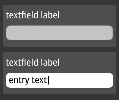
| TextField (Form) | |
|---|---|
Figure 2. Text field in Forms
 |
|
| Textbox | |
|---|---|
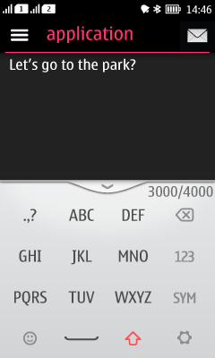
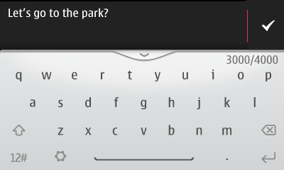
Figure 3. Basic Textbox, and Textbox in landscape
  |
|
| Textbox with ticker | |
|---|---|
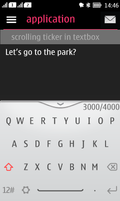
Figure 4. Textbox with ticker
 |
|
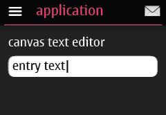
| Canvas text editor | |
|---|---|
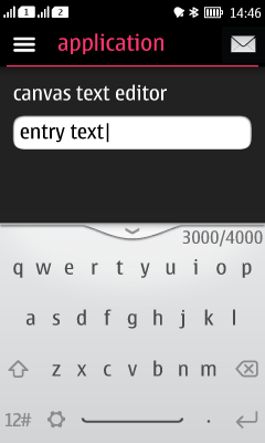
Figure 5. Canvas text editor in portrait and landscape
  |
|